


[heimdex people] The Language of Selling "What You Don't Do"|Design & Marketing
![[heimdex people] The Language of Selling "What You Don't Do"|Design & Marketing](https://storage.ghost.io/c/1b/90/1b90bca5-caef-43b3-90d6-4b197d90c045/content/images/size/w960/2026/08/-------------------_0806--3-.png)
Hi, this is Yangdi from Heimdex. 👋
The core value of Heimdex's product is "what it doesn't do." We don't upload video. We don't move the original files. We don't send anything to the cloud. But from a branding standpoint, "absence" is one of the hardest values to sell. You can't show or showcase something that isn't there.
We're sharing the story of this rebrand — led by product designer Junsu Kim and PM Heejo Kang — in two parts. Part 1 covers what came before the visual identity: how "absence" was turned into language, and how that language was pushed down into criteria you could actually judge a design against.
Q1. Junsu, what was the first thing you did after taking on the rebrand?
Hi, I'm Junsu Kim, product designer. My main work is designing screens, UI, and the design system — essentially the whole experience that helps users understand and trust what AI generates. I joined as a product designer, but I'd always wanted to work on logo and brand guideline projects too, so when this project came up, I took it without hesitation.
That said, the first thing I did wasn't sketch anything — it was cutting scope. Rebranding has no natural end point unless you decide where it stops. My rule was simple: start with whatever we'd have to redo later if we didn't lock it down now. We already had one live product, a playground, and a homepage running, so new screens kept getting built even while the rebrand was in progress. I prioritized the areas that would otherwise get built ad hoc, without any standard to follow.
| Chapter | What we finalized this round |
|---|---|
| 1. Brand Story | Brand Statement, BX Core Values, Team Core Values |
| 2. Design Principle | Brand Experience, BX Image, Experience Strategy |
| 3. Logo | Symbol, signature (horizontal/vertical), incorrect usage |
| 4. Color | Brand/Primary separation, background usage rules |
| 5. Application | Application across real touchpoints |
Q2. What was the hardest problem in shaping the brand language itself?
Two things kept coming up.
First, the core of our product is "what we don't do." We don't upload video, we don't move the originals. But negative phrasing is weak in brand messaging. "We don't do X" sounds defensive, and it implicitly assumes competitors do X — which puts them at the center of the sentence instead of us.
Second, our customers aren't in one industry. We go from entertainment production sets, to law firms' closed networks, to the edge environments robots operate in. Those three worlds speak different languages and buy for different reasons. But the brand statement has to be one sentence that works for all of them.
Solving these two problems was, in practice, the entirety of Chapter 1 — it took a lot of back-and-forth with the marketing team.
Q3. Heejo, how did you turn the first problem — "what we don't do" — into language?
Instead of writing a negative sentence, we placed two positive statements side by side.
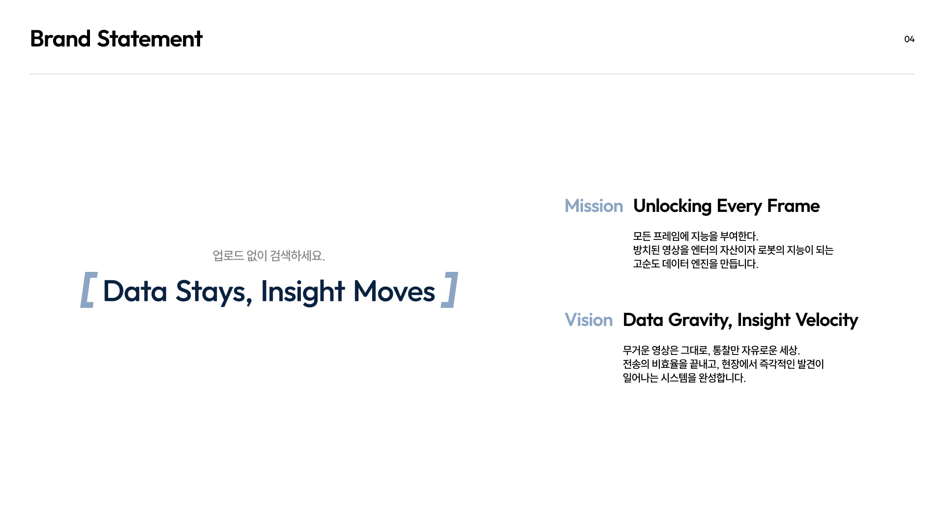
"Data Stays, Insight Moves"
"Doesn't" never appears once. Instead, we contrast two subjects. Data stays still; insight moves. One is static, one is in motion, in the same sentence. What we don't do (move the data) and what we do (deliver the insight) both land in a single line — and the "don't" side reads not as a limitation, but as deliberate design.
We also added a one-line explainer under the tagline.
Search without uploading.
The tagline states the structure; the subcopy states the action. "Data Stays, Insight Moves" sounds good on its own, but it doesn't tell you what to actually do. So the two lines always ship together.
Q4. How did you unify such different industries into one sentence for the mission?
We decided to strip out the industry and keep only the unit.
Mission — "Unlocking Every Frame"
We give intelligence to every frame. We turn neglected video into a high-purity data engine — an asset for entertainment, and intelligence for robots.
Entertainment scenes, evidentiary footage for law firms, visual training data for robots — at the end of the day, all of it is frames. The industries differ, but the smallest unit we work with is the same.
If the mission had included words like "video archive" or "media" that hint at a specific industry, we'd have had to rewrite it the moment we expanded into physical AI. A brand statement needs to grow as the company grows — put an industry name in it, and you've built yourself a ceiling.
This turned out to matter in practice later: when we met customers in new industries, we never had to touch the brand statement.
Q5. The Vision line uses "Data Gravity" — a term that's already used in the industry. Was that intentional?
Vision — "Data Gravity, Insight Velocity"
A world where heavy video stays put, and only insight moves freely. We're ending the inefficiency of transfer and building a system where discovery happens instantly, on-site.
Yes, that was deliberate. "Data gravity" is already a well-established term in infrastructure circles. (I actually learned it from Jiseok.) It's usually used to describe a problem to be solved. We decided not to fight that framing. A multi-terabyte video file genuinely doesn't move easily, and that's not going to change. What we changed instead is what does the moving — from data to insight. Gravity, we accept. Velocity, we build somewhere else.
Coining a brand-new term is more expensive to explain than redefining a word the industry already knows. When a customer says "oh, that data gravity thing," you get to start the conversation from a point they already understand. This idea — that data stays fixed while only the insight moves — became the starting point for our BX value system: Stay Secure and No Upload.
Q6. Your BX Core Values each have two names attached — like Stay Secure and No Upload.
That's intentional structure. The first name is what the customer gets; the second is what we actually do.
| Customer's language | Our language | What it means |
|---|---|---|
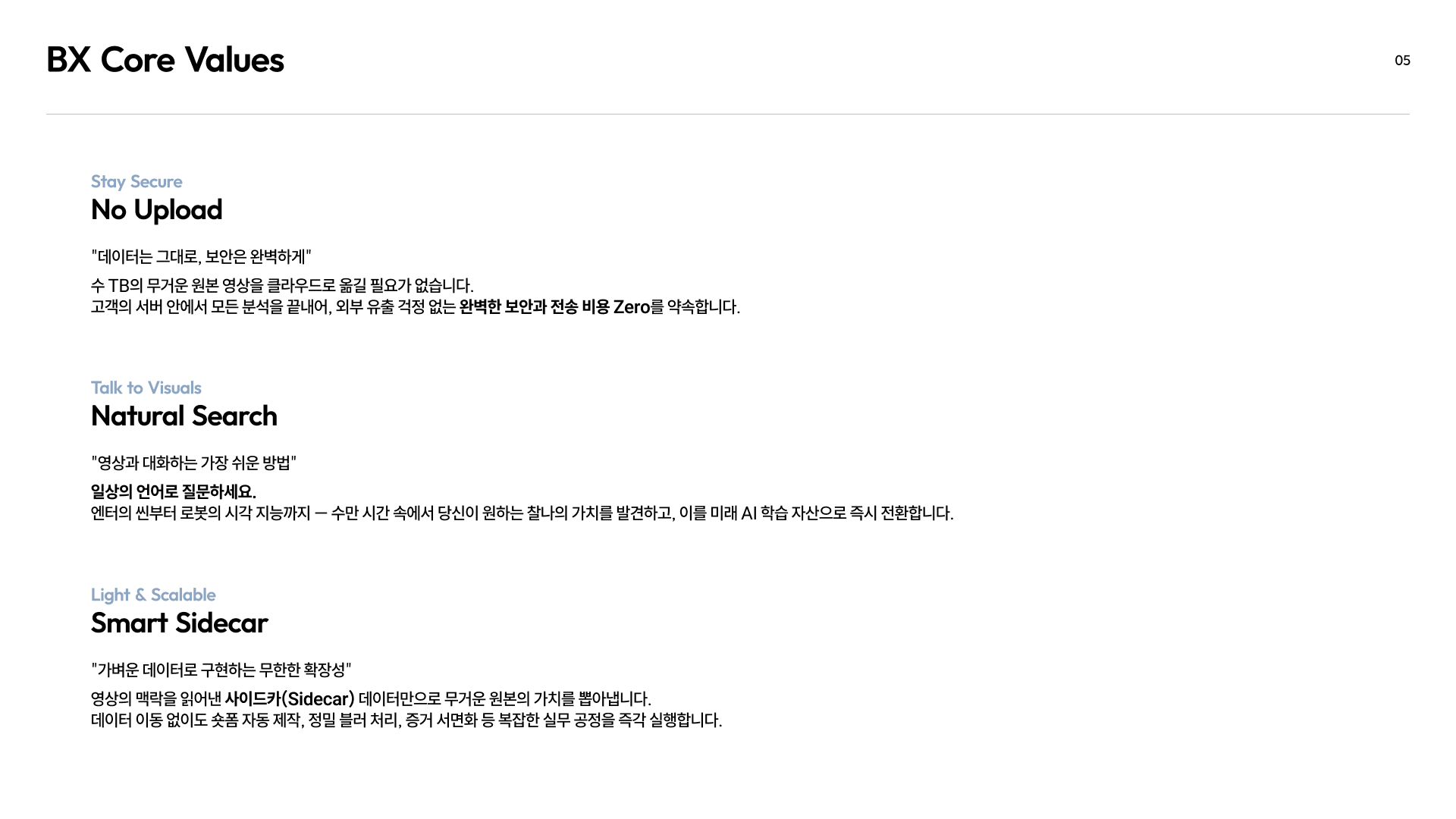
| Stay Secure | No Upload | Data stays put, security stays airtight. We complete analysis inside the customer's own servers — no need to move terabytes of original footage to the cloud. |
| Light & Scalable | Smart Sidecar | We extract the value of the original using only lightweight sidecar data that captures the video's context — enabling fast short-form editing, precise blurring, and evidentiary documentation without ever moving the source file. |
| Talk to Visuals | Natural Search | Ask in plain language — "someone wearing a red shirt" — and find the moment you need among tens of thousands of hours, turning it into an AI training asset. |
If we only had the technical name, customers wouldn't know why it matters to them. If we only had the benefit name, it would erase what technology is actually doing the work. So we kept both. In pitch decks and landing pages, we lead with the left column; in technical docs and proposals, we lead with the right.
We also made sure every customer-facing value starts with a verb — Stay, Talk. A noun-form value doesn't leave you with anything to do after reading it; a verb-form one does.
Q7. Junsu, everything so far is language. How did you bridge that into visual form?
We split the design principles into the same two layers as the values above.
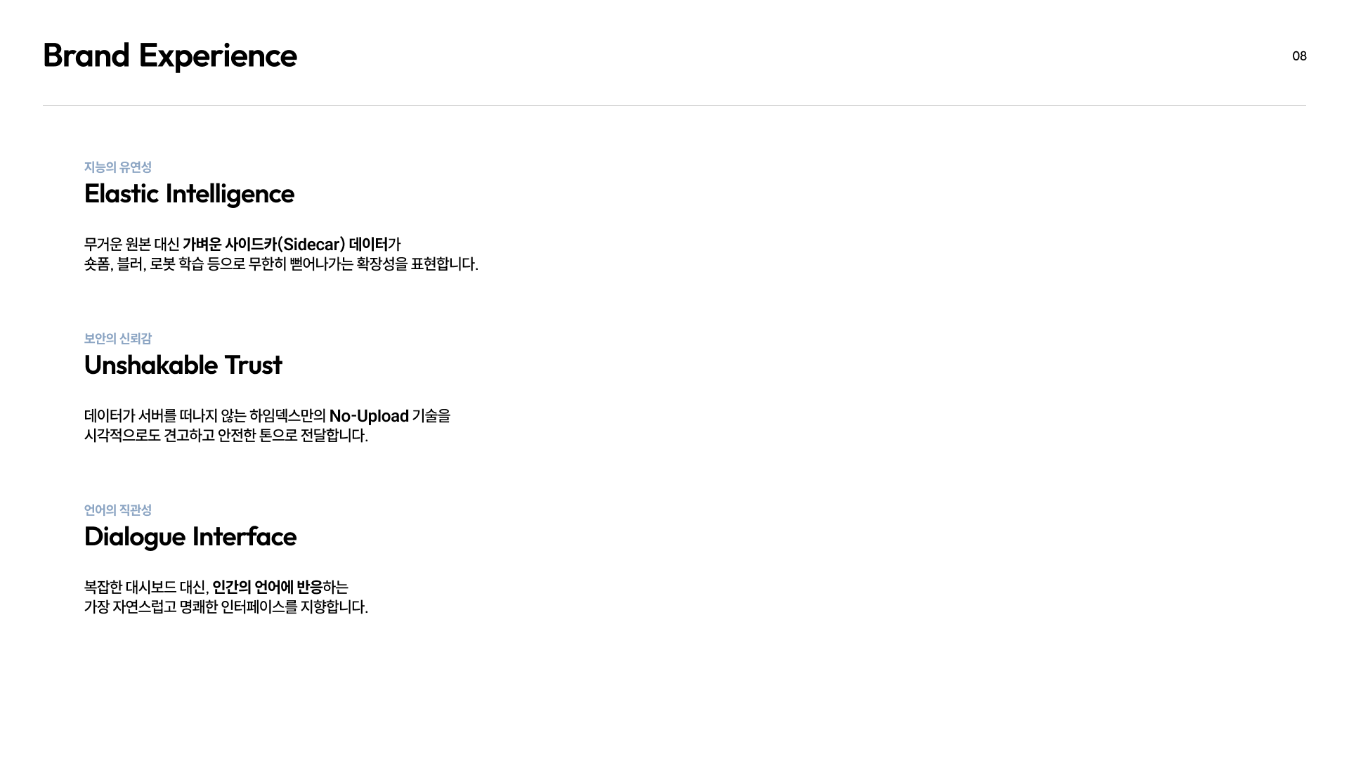
Brand Experience — what should people feel?
- Elastic Intelligence
- Unshakable Trust
- Dialogue Interface
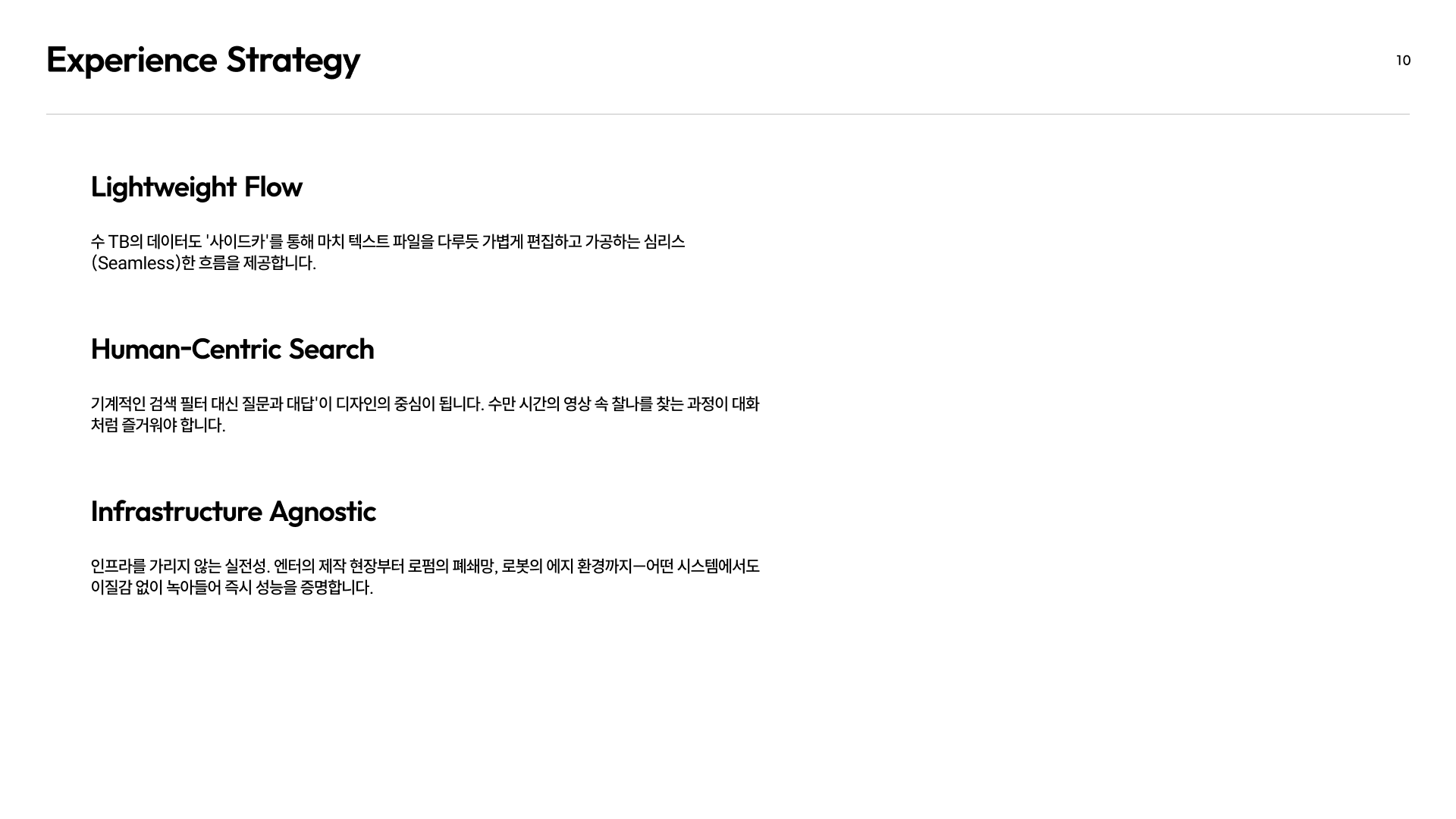
Experience Strategy — how does it have to behave to make that happen?
- Lightweight Flow
- Human-Centric Search
- Infrastructure Agnostic
If we'd stopped at the top layer, we'd have ended up with something like "make it feel trustworthy" — which doesn't actually decide anything. That's why we added the bottom layer.
We didn't weight all six equally, though. We put security first. Comparable products usually lead with speed, accuracy, or storage capacity — we lead with the fact that we don't move your data. So the brand had to start there too.
The problem was that "security and trust" are invisible concepts. It's hard to visually depict the absence of a leak.
So we set a clear direction first — "let security and trust come through in the shape and form itself" — and then translated that feeling into concrete design elements, one condition at a time. What came out of that is the design checklist I'll show you next.
Q8. That's still language, though. How did you use it to judge actual logo candidates?
We took it one level further — down to pass/fail criteria. No matter how good a candidate looked, if it failed even one of the six checks below, it was cut.
| Pass criterion | How we tested it | What happens if it fails | Which principle it came from |
|---|---|---|---|
| Minimum size | Shrunk to 16px/24px and placed in an actual favicon/sidebar slot | Shape blurs and stops reading as the brand | Lightweight Flow |
| Monotone integrity | Rendered in black-and-white only, no color | Breaks in watermarks, single-color print, dark mode | Infrastructure Agnostic |
| Dark/light compatibility | Tested against white, black, and navy backgrounds | Logo disappears against one of the backgrounds | Unshakable Trust |
| Layout compatibility | Assembled both horizontal and vertical signatures | Spacing rules can't be defined consistently | Elastic Intelligence |
| Non-interference with status colors | Placed next to success/warning/error colors | Brand color interferes with in-product status signals | Dialogue Interface |
| Token separability | Checked whether it splits into brand-layer and product-layer tokens | A single color can't build hierarchy in the UI | Elastic Intelligence |
If brand principles stay a declaration, nothing actually happens with them in practice. What you end up with is "I think this one looks better" versus "no, I like that one," and whoever's loudest wins. (We have a few loud voices on our team...) Turning the principles into a checklist up front was how we avoided that.
Q9. But if you're designing around constraints, doesn't everything end up looking similar? That might be why so many B2B logos look alike these days.
That's a fair point — and it's the biggest risk with this approach.
When you look for a shape that survives shrinking down, still reads in dark mode, and still works in a single color, the space of answers narrows. You converge toward geometric, simple, near-symmetrical forms. The harder you follow the constraints, the more you end up looking like everyone else.
Heejo hated that pattern viscerally, and honestly, at this point I get tired just looking at another purple-gradient logo, too.
To avoid that trap, we used constraints only as a filter for narrowing candidates — never as the source for generating them. Candidates came from the sentences we'd already written. The starting question for form wasn't "what shape looks nice," it was "what is the actual structure of our technology."
Honestly, I'm not fully confident about this part yet. Differentiation isn't something you can claim the day you finish the guidelines — the market decides that a few months out.
Drawing "Absence": The Moment Sentences Become Shape
Beyond simple constraints, how did we translate Heimdex's genuinely unique technical structure into a single visual symbol?
Part 2 covers the process behind Heimdex's signature form — and the record of the intense work it took to pass every verification checklist on the way to the final logo and design system. Stay tuned.
We work with people who understand the size of invisible value.
Heimdex is a team that pulls invisible potential and insight out of massive, heavy video data.
Rather than boasting about transfer speed or cloud storage capacity, we place a higher value on "Security" — quietly guarding every pixel of a customer's data so none of it ever leaves their servers — and on "Intelligence" — reading context without ever moving the original file.
AI researchers who think about the best models while working on data that never moves. Engineers who quietly build a stable technical backbone behind the scenes. Designers and marketers who translate that rigor into intuitive UX and solid language.
People who care more about the boundaries technology has to protect than about how flashy it looks — that's who's building Heimdex's future.
Solving hard problems with technology, and proving that technology's value in the most intuitive language possible — that's the work. If you'd like to be part of Heimdex's journey, or you're curious about our technology, feel free to reach out anytime.
- Careers: [job posting link] / heimdex@heimdex.co