


[Heimdex People] How a Single Bracket [ ] Became the Visual Language of Heimdex's Technology | Design
![[Heimdex People] How a Single Bracket [ ] Became the Visual Language of Heimdex's Technology | Design](https://storage.ghost.io/c/1b/90/1b90bca5-caef-43b3-90d6-4b197d90c045/content/images/size/w960/2026/08/-------------------_0806--4-.png)
Hi, this is Yangdi from Heimdex.
In Part 1, we talked about how we scoped the rebranding project and distilled our brand statement into six evaluation criteria. Part 2 is about applying those criteria to actual visual form — and it's a record with more rejections than approvals.
Q1. Looking at the old logo through those six criteria, how did it hold up?
As a product designer, whenever I looked at the logo, I kept picturing it inside actual product screens — how it would look in a favicon, or squeezed into a sidebar.
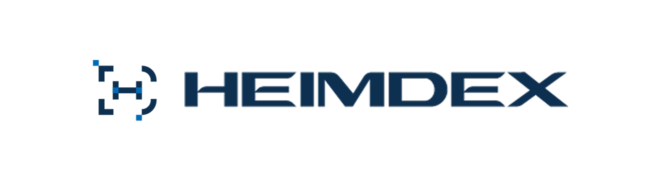
After a lot of back-and-forth with the team, we narrowed it down to three core problems with the existing logo:
- Poor visibility on dark backgrounds: On dark surfaces, the logo would blend in and become hard to see.
- Illegible at small sizes: A small blue square element floated above the logo. At smaller sizes, it stopped reading as part of the logo and just looked like a stray dot.
- Hard to define layout and spacing: The shape itself made it difficult to establish a visual center, which made it hard to set consistent margins around it.
Q2. That third problem sounds a bit abstract — how did it actually show up in practice?
Spacing isn't a matter of taste — it's a rule. Typically, logos follow a "clear space" rule, something like: nothing is allowed to intrude within half the symbol's height around the logo.
The problem was that setting this rule requires the logo itself to have a clear visual center or a repeating unit to measure from. Our old logo didn't have that, so whoever was placing it in a header ended up eyeballing the margins differently every time. The result: the logo's size and spacing varied across document covers, web headers, and slide masters.
Any single instance of this looks minor on its own. But across dozens of screens, it accumulates into something that reads as "this brand isn't being managed carefully."
Q3. I'm curious about the process of finding the new form — were there directions you explored and abandoned?
We started by asking how to visually express Heimdex's core function — "No Upload," the idea of extracting value without ever moving the original file. We found our answer in a symbol familiar to developers: the square bracket [ ].
[ ] — the symbol that opens an array or index
- The original data never leaves the customer's server
- It matches perfectly with the nature of indexing — pulling out value without moving the source
- It's an "open bracket" — it wraps data without enclosing it
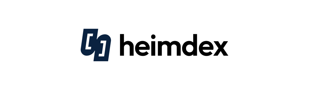
[ ] is a symbol that doesn't copy the original data — it just points to where a value lives. That's exactly the technical philosophy behind Heimdex: leave the original on the customer's server, and surface only the value. We simplified this indexing symbol [ ] together with the initial "h," blending curves and straight lines into a solid-plane structure to create the final symbol.
We also tested a line-based version of the symbol along the way, but at small sizes — around 16px — a 1px line would blur into a gray smudge across half-pixel boundaries. So we settled on a solid-plane form instead. The result held its shape even at small sizes, kept a clear silhouette on dark backgrounds, and stayed balanced in both horizontal and vertical layouts.
Q6. The wordmark also changed from a capital "H" to a lowercase "h" — that stood out.
Wherever we actually type "heimdex" in real life — heimdex.com, @heimdex — it's always lowercase. So this wasn't really a new decision as much as the logo catching up to how the name was already being used.
Visually, lowercase "h" is also much more compact horizontally. The old capital-letter wordmark had an aspect ratio of 10.9:1; switching to lowercase brought it down to a more stable 4.9:1. Wordmarks over 10:1 tend to be the first thing that gets clipped in a narrow header or on a mobile top bar, so this mattered. We also found that when placed next to the symbol, the two didn't read as one cohesive unit — the symbol was nearly square while the wordmark was long, so they looked disconnected. To fix that, we set the following rules:
[Symbol-to-wordmark ratio rules]
- Symbol shape: roughly 14:15, a near-square vertical form
- Height ratio: symbol height : wordmark height = 3 : 2
- Spacing: gap between symbol and wordmark ≈ 3/10 of the symbol's width
Q7. I heard the brand color decision was also a pretty intense process.
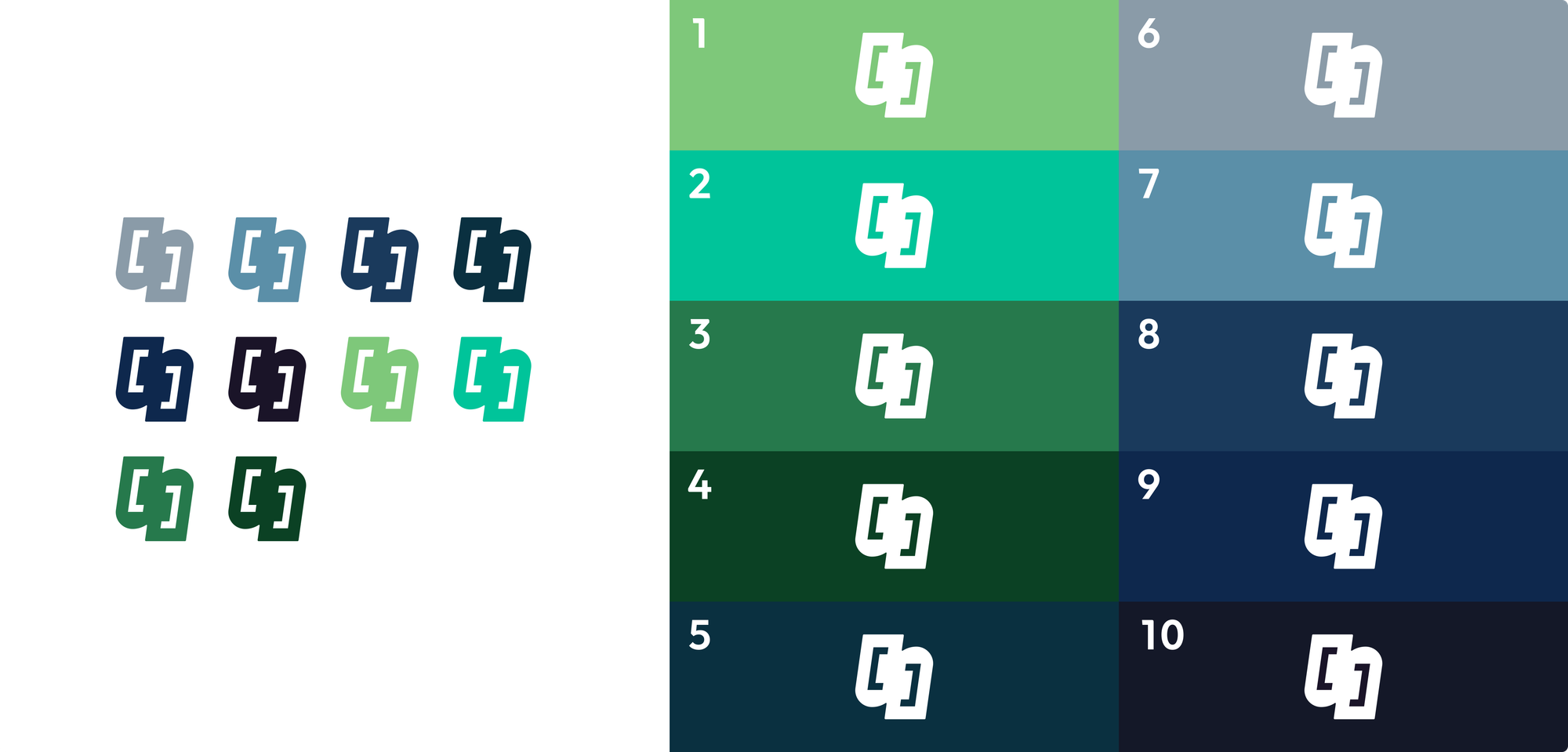
With security and trust as our core values, we started with ten candidate colors across blue and green families. But internally, some team members felt green "reads as an eco-friendly company," which risked brand confusion — so we dropped the green options and converged on a deep navy tone.
That said, a single navy color alone couldn't establish enough hierarchy inside the product UI, so we split the roles into a Brand Color and a Primary Color.
| HEX | Contrast on white | Primary use | |
|---|---|---|---|
| Brand Color | #0A2240 | 15.96 : 1 | Where the brand declares itself (logo, covers, backgrounds) |
| Primary Color | #234C77 | 8.85 : 1 | Where users interact within the product (navigation, core UI) |
The reasoning was straightforward. The Brand Color, #0A2240, is dark enough that its contrast against our standard body-text black (#1A1A1A) was only 1.09:1. Used on a button, it would be nearly indistinguishable from body text — and it left no room to express hover or pressed states with distinct brightness steps.
Lifting the brightness one step to #234C77 solved that — hover (1.34:1) and pressed (1.65:1) states became clearly distinguishable. In the end, we redefined the two colors by purpose: Brand Color answers "who we are," and Primary Color answers "where do I click."
Q8. So do those two colors solve everything?
Not quite — splitting the roles surfaced a new problem. Things looked completely different once the screen went dark.
#234C77 has plenty of contrast on white (8.85:1), but placed on our dark Brand Color background (#0A2240), that dropped to 1.80:1 — and 2.37:1 on pure black. Both fall well short of the 3:1 minimum for UI legibility. In short: a color built for light mode simply didn't work as-is in dark mode.
Rather than just bolting on one more standalone color — which wouldn't scale well long-term — we redesigned Primary Color as a full brightness scale instead of a single value. Same hue, different lightness steps, so each theme pulls from the step that works for it.
| Theme | Step used | Background | Contrast |
|---|---|---|---|
| Light | Primary 500 #234C77 | White | 8.85 : 1 |
| Dark | Primary 300 #6198D1 | #0A2240 | 5.26 : 1 |
With this approach, the original #234C77 didn't disappear — it just became the "500" step within the scale.
One more thing we had to be careful about: when Primary 300 is used as a button surface in dark mode, the text on top needs to be #0A2240, not white — white text only reaches 3.03:1, which falls short. Carrying over the light-mode habit of white text would make it unreadable again.
We won't fully know how this plays out until an actual dark-mode UI exists — for now, we've locked in the rules in advance.
Q9. The more I hear, the more this sounds like perspective that could only come from a product designer doing BX/BI work. Did your process differ from a typical branding workflow?
The priorities were different. Even while sculpting the logo shape itself, I kept asking "where in the actual product screen will this element sit?"
So I always kept a mini-preview at 16px and 24px open in a corner of my canvas while working. The logo spends far more time living in small environments — a sidebar header, a browser tab favicon — than it does being shown large.
I also made a habit of considering different UI states. Beyond the normal view, products have loading states, empty states, error states — and the logo needs to function consistently across all of them.
Finally, I kept systemization and handoff in mind. Rather than relying on subjective feel, I documented everything as numeric rules — 3:2, 3/10 — so the same result gets built consistently in development and production, even without a designer in the room.
Of course, on questions of the brand's overall visual polish and its relationship to other brands, we kept sharing drafts and gathering feedback from the team throughout.
Thank you to Junsu, who defined the essence of our product in a clear visual language and completed a new identity that is uniquely Heimdex's own. The Heimdex team will keep building an environment where every team member can grow while putting their own capabilities fully to work.
We'd love your interest and support as Heimdex's reborn logo — and the vision ahead — takes shape.
Careers: [job posting link] / heimdex@heimdex.co