


Building a Screen You'll Use 300 Times a Day: Why Heimdex Made Its Own Labeling Tool
Hi, this is Yangdi.
Heimdex builds an AI platform that lets people search video using natural language. Type in something like "a scene where two products are being compared side by side," and the system pulls that exact moment out of an archive that might run hundreds of hours long. That same AI engine also powers scene-by-scene analysis, automatic short-form clip generation from the most relevant moments, and compliance blurring that mosaics out sensitive content on screen.
Building this required us to first answer a foundational question: what's the right basis for cutting a video into scenes? Heimdex defined that standard from scratch, working through six categories of Korean-language video — cooking shows, news interviews, home-shopping livestreams, and more — to build a ground-truth evaluation set for Korean video content.
We needed that ground-truth data for a simple reason: without a defined standard, there's no way to know what part of the AI needs fixing, or whether a fix actually helped. Measuring the accuracy of speech recognition or search performance requires human-verified reference data as a baseline.
To collect that reference data, AI engineer Jaehee Lee and product designer Junsoo Kim built a labeling tool from the ground up, purpose-built for Heimdex's own workflow. This piece is an interview with both of them about the behind-the-scenes work — and the hard trade-offs — that went into building the tool that ultimately shaped the product's success.
Q1. As a marketer, I don't have a great feel for this. Isn't a labeling tool just a simple screen with some text fields and a save button? What made it hard?
Junsu: As a product designer, I assumed the exact same thing at first — a few input fields and a "save" button at the bottom, nothing complicated.
Then I actually did the labeling work myself, and that assumption fell apart. This screen is a high-difficulty work environment where a person's ears, eyes, and hands all have to move independently at the same time. Your ears are tracking audio that's continuously playing, your eyes are reading on-screen text, and your hands are typing — and the pace of the audio, the pace of your typing, and the pace of your reading are all completely out of sync with each other.
Jaehee: There's another important factor: this is a screen one person uses hundreds of times a day, doing the exact same task each time.
With a typical consumer app — a food delivery app or a shopping app — one extra click here or there doesn't really bother anyone. But a labeling tool where someone repeats the same task 300 times a day is different. Add one unnecessary click, and for that person it compounds into 300 extra finger movements' worth of fatigue and strain, every single day.
So the sense of responsibility and the weight of every design decision — down to a single button or a single screen layout — was completely different from a typical product.
Q2. There are already plenty of labeling tools on the market. Why did you build a new interface instead of using one of those?
Jaehee: The first thing that stopped us in our tracks was working with video scene segments. Most existing tools are built for static tasks — drawing a bounding box around a car in a still photo, or tracing an outline along an edge.
What we needed was the opposite of a still frame: continuous video. We needed to listen to audio in real time and identify something like "from 1:20 to 1:45, this is a cooking segment" — and then cut that range out. No existing tool properly supported that workflow.
We looked at whether we could just tweak the settings on existing tools, but concluded that simple configuration wasn't going to get us there. Most general-purpose labeling tools are really just about arranging where input fields sit on the screen. What actually mattered to us wasn't where the fields were positioned — it was the sequence in which a labeler makes each judgment.
Junsu: On top of that, existing tools couldn't replicate the decision logic and shortcuts we needed.
We needed one keystroke — Enter — to chain together "move to the next field → select the next sentence → auto-play," all in a single action. Existing tools let you remap where a key sits, but they can't create a brand-new chained action like that.
We also needed rules that compare a new entry against the previous one — for example, "if the label name matches the prior segment but the actual subject has changed, block saving unless a note is added." Or values like a "boundary confidence" score, which the system needs to calculate automatically by comparing multiple factors — that can't be left up to the labeler to eyeball and enter manually. Ultimately, the screen had to actively guide labelers through a flow of "watch and listen → judge → record." A tool that's just a box of assembled input fields can't design that core flow at all.
Q3. Why did the product designer sit in on the labeling-rule (schema) design meetings too?
Junsu: Exactly because of that same logic. The screen layout itself was actively steering people toward mistakes. When we dug into the errors that kept coming up, the root cause wasn't labeler carelessness — it was how the screen was guiding their attention.
Take an example: a news anchor is talking in studio, and behind them, a large monitor is playing footage of an outdoor press conference.
- The correct answer: this is footage of a press conference being played on a screen inside a news studio (location: studio)
- The labeler's mistake: writing down "outdoor press conference," based on what's visually on screen (location: outdoors)
A labeler naturally enters what they see first, intuitively. If the screen doesn't first prompt the question — "is what you're looking at the actual location, or is it footage being played back inside a studio?" — nearly everyone will mark "outdoors," because that's what's visually in frame. It didn't matter how clearly the guideline document said "footage shown within a news broadcast should be labeled as the studio" — it got ignored anyway.
In the end, the rule itself wasn't wrong — the screen layout was inducing the mistake. Preventing that kind of error required deeply understanding the sequence of judgments a labeler goes through in their head, which is why I, as the designer, needed to be in every rule-design meeting.
Q4. So how did you approach the overall screen structure?
Junsu: The core principle was: a labeler's attention should flow in one direction only.
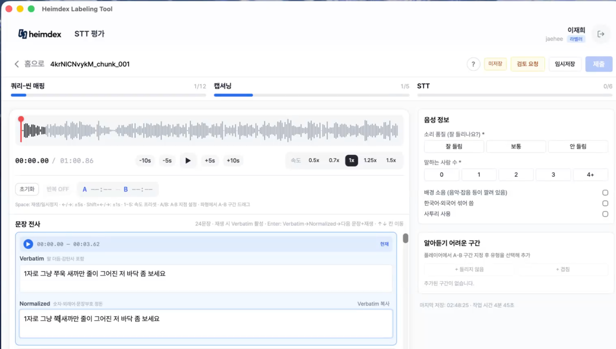
We split the screen left and right. The left side holds the raw material for a judgment — the audio waveform player, the transcribed sentence. The right side holds the outcome of that judgment — voice metadata, segment-entry fields. That way, the natural flow of "listen → judge → record" moves left to right across the screen, matching how someone actually works.
At the top, we always show live progress across all three work tracks (query-to-scene mapping, on-screen description, and speech transcription). If that were hidden behind tabs you had to click into, people would easily lose track of where they stood in the overall task. Not knowing how much work is left is, on its own, a major source of fatigue in repetitive work.
Q5. Could you walk through one of the three tracks as an example? How did you redesign the "query-scene mapping" screen specifically?
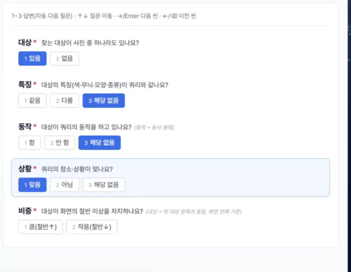
Junsu: Originally, we showed multiple scenes at once in a grid, and clicking one opened an evaluation panel on the right. But that structure meant your eyes were constantly bouncing between the full grid and that side panel, which kept breaking your train of thought — "wait, what did I just see?", "what am I actually evaluating right now?"
So we switched to a single-scene focus view. Only one scene is shown at a time, large, and pressing 1, 2, or 3 automatically advances to the next one. When you're only ever shown one thing to judge at a time, there's nothing to compare it against — which also reduces the chance that your judgment drifts or gets inconsistent.
Q6. Was there anything you approached differently for repetitive-task screens specifically?
Junsu: We started by literally counting how many times a labeler's hand left the keyboard. This wasn't purely about speed. Our task involves judgments that are much more complex and time-consuming than simply drawing a box on a still photo. The more complex the judgment, the more easily accumulated fatigue causes the standard itself to drift over time. So our goal wasn't "make it faster" — it was "keep the standard from drifting, even during long stretches of work." And the key to that was keeping hands on the keyboard.
Jaehee: In the early version, processing a single sentence required four separate round trips with the mouse: click play → click the input field → type → click the next field → type → click the next sentence → click play again. With 24 sentences per segment, that's 96 mouse movements. Now, a single Enter key press chains together "type what you hear → type the cleaned-up version → move to the next sentence and auto-play." A labeler can complete an entire unit of work without ever touching the mouse.
We also learned that hiding shortcut keys inside a help panel means nobody ever finds them. So we put them right where people are looking — directly under the player and at the top of the text section (e.g., "Space: play/pause," "1–5: playback speed") — so they're impossible to miss. We also replaced a fiddly slider for playback speed with fixed buttons (0.5x, 0.7x, 1x, 1.25x, 1.5x), so someone can reliably jump back to "that exact speed from before" at any time.

Q7. What internal feedback was the hardest to hear?
Jaehee: "There are too many actions the user has to take." The moment we saw the number — four mouse round-trips per sentence — it was obvious that at 300 repetitions a day, this was directly degrading data quality. That's what led directly to the chained Enter-key shortcut I described earlier.
Junsu: The second was: "There's too much white space on the right — make the image bigger." The whole point of this task is judging what's on screen, and yet we'd shrunk the very thing people needed to examine in order to make the layout look clean. We assumed a zoom feature would compensate, but for someone clicking "zoom" 300 times a day, that click is itself a penalty.
White space builds trust on a landing page. On a working screen, white space just means the thing you're supposed to judge got smaller. We also got feedback that the play button was too small and caused frequent misclicks, so we made it significantly bigger. A button someone presses 300 times a day and a button someone presses once a month can't be the same size.
Q8. How did you keep labelers' answers consistent with each other on open-ended fields and captioning tasks?
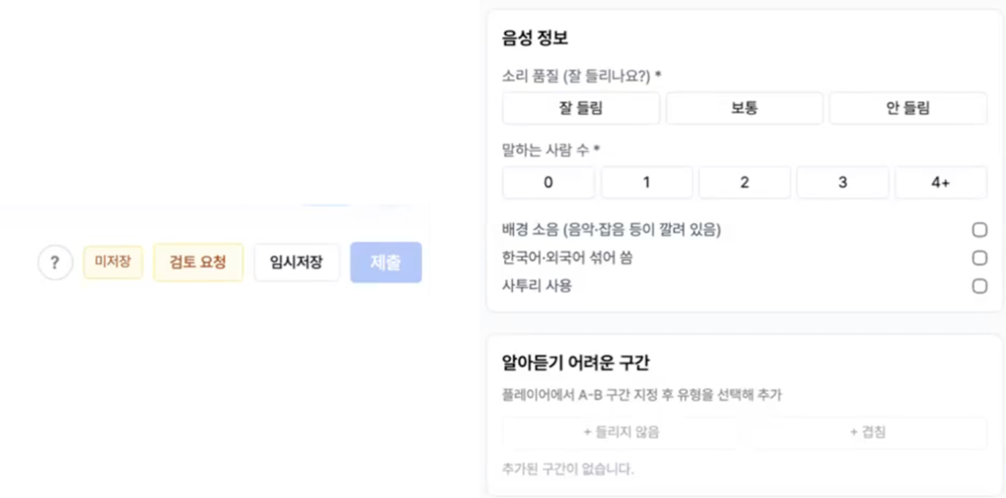
Jaehee: When labelers write free-form descriptions, everyone phrases things differently, and most of that data ends up unusable once you try to aggregate it. So we converted nearly every field into a fixed set of choices — audio quality as Clear / Moderate / Inaudible, number of speakers as 0 / 1 / 2 / 3 / 4+, and so on.
Instead of dropdowns that hide the options, we used segmented buttons that show every option on screen at once, so a single click finishes the field. Right next to each field label, we added a short guide — for example, "Verbatim" (include stutters and filler words) versus "Normalized" (clean up numbers and loanwords). Labelers should never have to open a separate guideline document to check a rule — the standard needs to live right where the decision is being made.
Even for the hardest field — video "mood" — instead of free text, we built a two-step selector: pick a broad category on the left, then narrow into specific options on the right. That let us collect even subjective descriptions into consistent, comparable categories.
Q9. Were there other UI mechanisms specifically aimed at reducing mistakes or fatigue?
Junsu: We focused less on showing good error messages and more on making certain errors structurally impossible.
Timecodes are a good example. Early on, we had people manually type in a timestamp (e.g., 01:23), and any formatting slip would break all the downstream calculations. Now, one button click pulls in the exact current playback position, which eliminates that class of error entirely.
We also changed how saving works. With a single "Save" button, a labeler facing an ambiguous case is effectively forced to either guess and submit, or skip it. So we split it into Save Draft / Request Review / Submit, and added dedicated paths — like "inaudible" or "overlapping audio" — for genuinely ambiguous segments. Being able to represent "I'm not sure" on screen is what turns an ambiguous case into useful data instead of a wrong answer.
We also split what used to be batches of 40 tasks into chunks of 10, shown with a running counter (like 1/12, 1/5). Frequent hits of "I just finished one" keep motivation and data quality high all the way to the end of a session.
Q10. What difference did all this careful design work actually make to real product performance?
Jaehee: The labeling tool isn't something customers ever see, and it never shows up in a demo. But the ceiling on our AI search quality is set entirely by the quality of our labeled data. If scene boundaries are marked ambiguously, the AI ends up retrieving the wrong segments; if transcription drifts, search breaks down along with it. No amount of model tuning can push performance past the ceiling that data quality sets.
The reference data we built wasn't just used for evaluation — it became core training material for fine-tuning Heimdex's own speech-recognition model. Using 800 scene mappings and 1,500 on-screen descriptions, that work improved our CER (character error rate) by 2.39%, and improved top-result search accuracy (nDCG@10) for our fusion search — combining video and audio — by 25%.
Looking back, this entire effort comes down to one question: where does the screen lead the person using it?
A single-scene focus view. Shortcuts that never make you leave the keyboard. A timecode field that just pulls in your current playback position. All of it comes from one principle: keep the person from second-guessing themselves at the exact moment they're making a judgment.
Performing well on a public AI benchmark and performing well on a real client's messy video archive are two completely different problems. The video we actually work with has multiple people talking over each other, subtitles covering the frame, and a home-shopping host describing the same product thirty different ways over the course of an hour.
If you're working on genuinely hard data problems like these and want to push real AI performance forward, we'd love to hear from you.
Careers: [job posting link] / heimdex@heimdex.co