


How to Choose Video Fonts That Boost Your Views (ft. Free Font Downloads)
90% of beginner editors ruin their video retention because of this one mistake.
In today’s endless ocean of short-form content, you can spend all night cutting clips and adding flashy effects. But if your views and watch time are still hitting rock bottom, the problem might be surprisingly simple: your fonts and layout.
I recently audited a fellow creator’s channel. They were frustrated, asking, "The content is genuinely engaging, so why is nobody watching until the end?" Looking at their audience retention graph, the issue was clear—their views took a massive nosedive within the first 5 seconds.
The moment I hit play, I saw the culprit. The caption font was too thin and illegible. Instead of enjoying the video, viewers had to strain their eyes just to read the text. The resulting visual fatigue caused them to swipe away immediately.
Why does this happen? Audiences are incredibly sensitive to visual friction. When scrolling, the human brain subconsciously looks for the path of least resistance. If a font is hard to read or poorly placed, the brain gets frustrated and skips the video. In other words, fonts and layouts aren’t just about making your video look "pretty"—they are powerful retention tools designed to lock in the viewer's brain.
To help your videos hack the algorithm and go viral, here is the ultimate practical guide to choosing and styling your fonts.
💡 TABLE OF CONTENTS
- Golden Rules for Bulletproof Video Typography
- Top Font Recommendations by Use Case
- The 1-Second Shortcut to Perfect Captions
Golden Rules for Bulletproof Video Typography
- Prioritize Readability Over Everything:
Short-form captions need to be processed in less than a split second. Leave the cute, aesthetic cursive handwriting fonts for thumbnails; clean, heavy sans-serif (Gothic) fonts are the undisputed kings of short-form videos.
- Stick to 1 or 2 Fonts Max:
It’s tempting to use multiple flashy fonts to make your video look dynamic, but this usually just creates visual clutter. All you need is one font for titles and one font for captions.
- Contrast is Key:
Never let your text get swallowed by the background. Use bright text on dark backgrounds, and always add a subtle Drop Shadow or a clean Outline (Stroke) to separate your words from the video footage.
- Always Check Copyrights:
While many fonts are free for personal use, you must ensure they allow commercial use before featuring them in monetized content.
- Establish a Visual Hierarchy:
If every piece of text on the screen is the same size, the viewer's eyes won't know where to look. Make your titles huge, your main captions readable, and your keyword callouts pop with a different size or color.
Top Font Recommendations by Use Case
- Top Fonts for Titles & Thumbnails
These are bold, high-contrast fonts designed to hook viewers in the first 0.5 seconds, or elegant serif fonts that elevate the overall mood of your vlog.
| Font Name | Best For & Aesthetic | Where to Download |
| Bebas Neue | The Gold Standard for Shorts. A tall, bold, all-caps font. Perfect for fast-paced content, sports, tech, and MrBeast-style energetic titles. | |
| Anton | Even thicker and heavier than Bebas Neue. It’s the ultimate choice for challenge videos, fitness content, or high-stakes thumbnails where you need maximum impact. | |
| The Bold Font | Widely used by business, productivity, and self-improvement creators. It has a solid, punchy look that fills up the screen perfectly. | |
| Playfair Display | The "It-Girl" Vlog Font. A timeless, elegant serif font commonly seen in daily vlogs, fashion, and beauty openings. Perfect for that minimalist, New York aesthetic. |
- Best Fonts for Captions & Subtitles
In short-form video, captions aren't just for accessibility—they drive viewer retention. The US trend heavily favors geometric sans-serif fonts that are incredibly easy to read on mobile screens.
| Font Name | Best For & Aesthetic | Where to Download |
| Montserrat | The #1 Most Popular Short-Form Font. Creators almost exclusively use the Black (900) or Extra Bold weights. This is the exact base font used for the viral Alex Hormozi-style, word-by-word pop-up captions. | |
| Poppins | Slightly rounded, sleek, and modern. It’s the favorite caption font for lifestyle vloggers, interior design creators, and beauty gurus who want a clean yet friendly look. | |
| Inter | The ultimate minimalist font. It gives off a premium, Apple-like vibe. If you want your audience to focus purely on your video footage without bulky text distraction, this is it. | |
| Helvetica / Arial | The ultimate classics. Many top-tier creators still stick to these because they are timeless, neutral, and universally readable. | Pre-installed on Mac/Windows |
The 1-Second Shortcut to Perfect Captions
If browsing fonts, adjusting text sizes, and constantly guessing where to place your text to avoid UI clutter sounds exhausting—there is a much faster way.
Try Heimdex, the ultimate AI-powered short-form video editor. It completely eliminates the tedious guesswork of video typography.
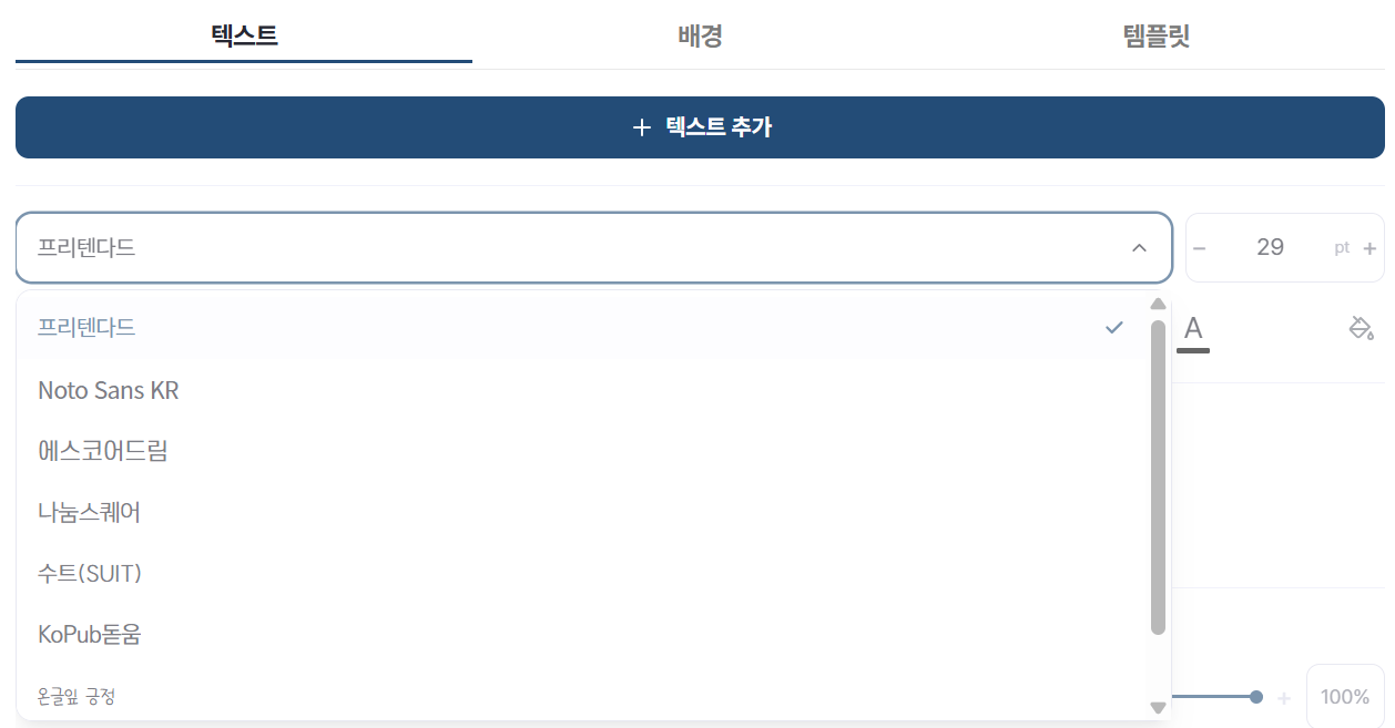
With Heimdex, you get instant access to a curated library of top-tier fonts. The absolute best part? Heimdex automatically detects and maps out social media "Dead Zones." You no longer have to manually calculate where TikTok or Instagram Reels will overlay their like buttons and usernames. The system handles it for you, placing your captions in the perfect sweet spot every single time.
Cut your editing time in half and create high-retention shorts even if you have zero design skills. Give Heimdex a try today!
